← All works
4x paid conversion: Optimizing the end-to-end first-time user journey
Work project
Consumer
Fintech
Redesign
⏺ Shipped
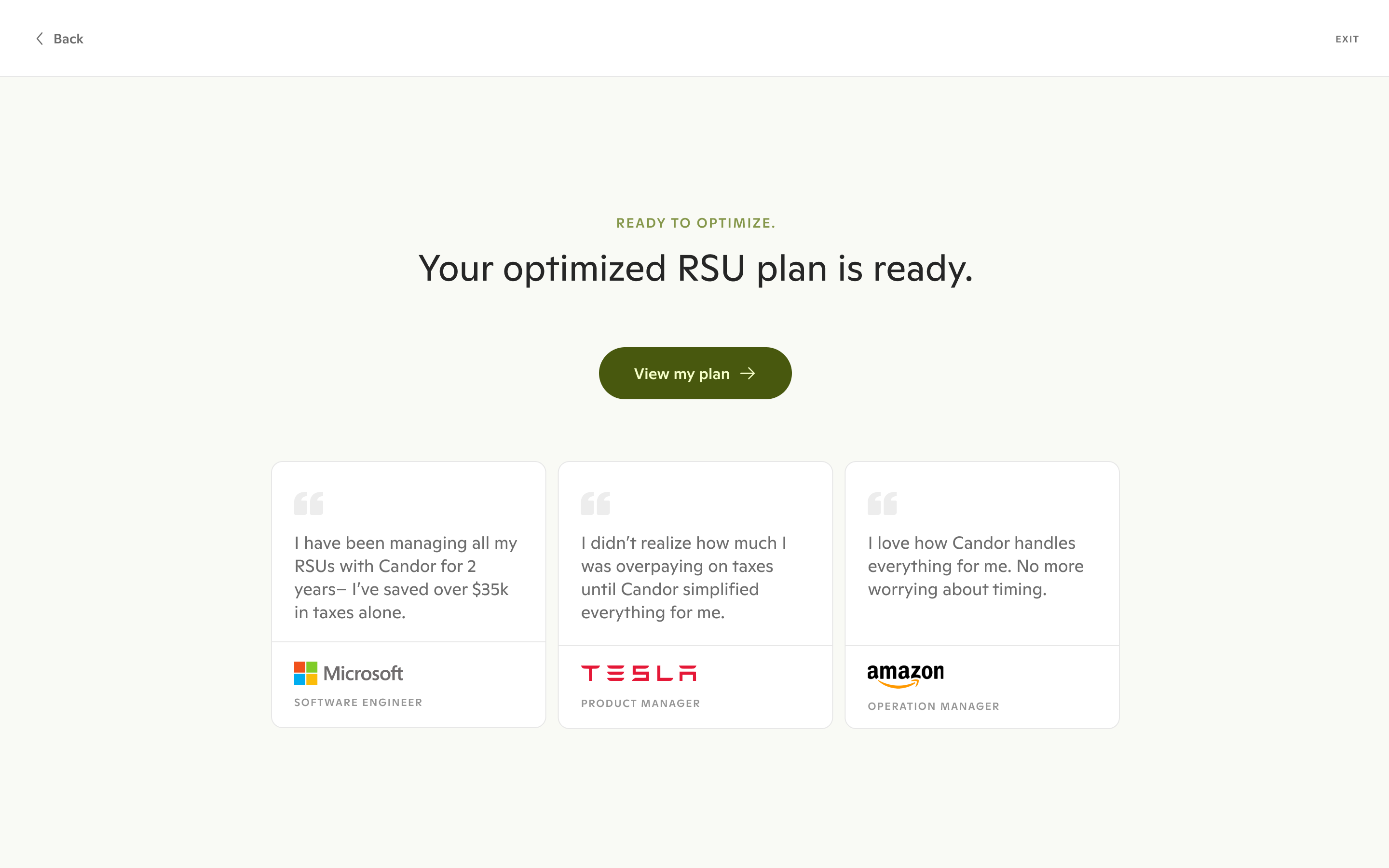
Trusted by employees from Microsoft, Tesla, Amazon, Meta, Oracle, Adobe, and more.
My contributions:
1. Conducted foundational user research to identify pain points and define key user segments to align priorities
3. Developed 13 growth hypotheses
4. Redesigned the end-to-end user journey including a 1st-time setup flow and multiple dashboards to track tasks and financial data.
5. Led evaluative research sessions and iterated on designs based on user feedback
6. Partnered with design colleagues on visual identity and design system overhaul
7. Collaborated closely with engineering throughout implementation and QA process
My role
Lead product designer
Collaboration
1 product manager, 1 brand designer, 4 engineers, 1 financial analyst
Project time
2025, 5 months
Status
Shipped
Problem: Users take a quiz to get a personalized RSU selling strategy, but significant drop-off at signup and throughout the quiz limited conversion to paying customers.
Solution: 1. Repositioned signup to the quiz midpoint using the personalized plan as a hook; 2. simplified financial concepts; 3. shifted focus from already-vested RSUs (high commitment) to upcoming vests (lower pressure). Key screens:
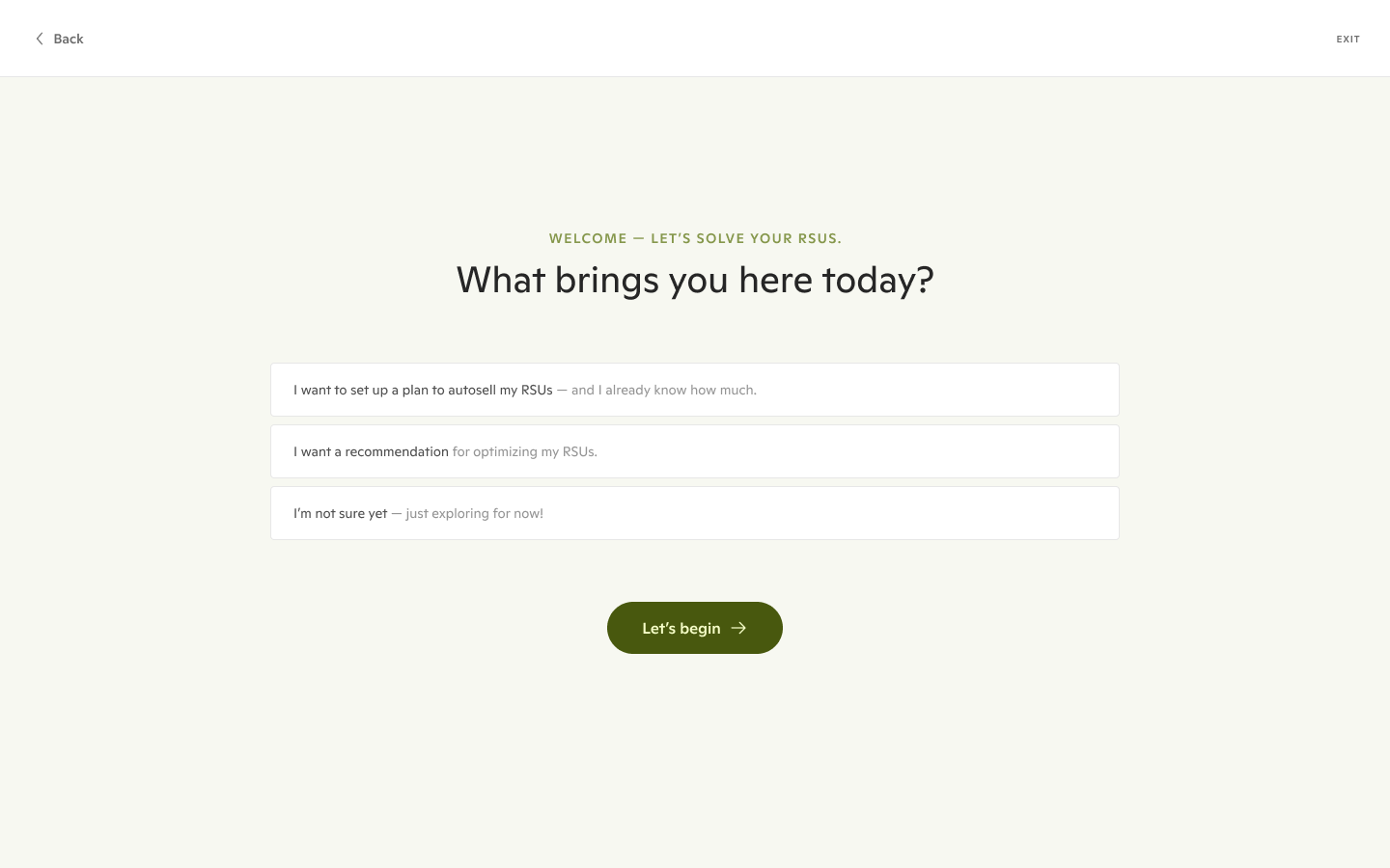
01. Quiz questions
02. The hook before the signup wall
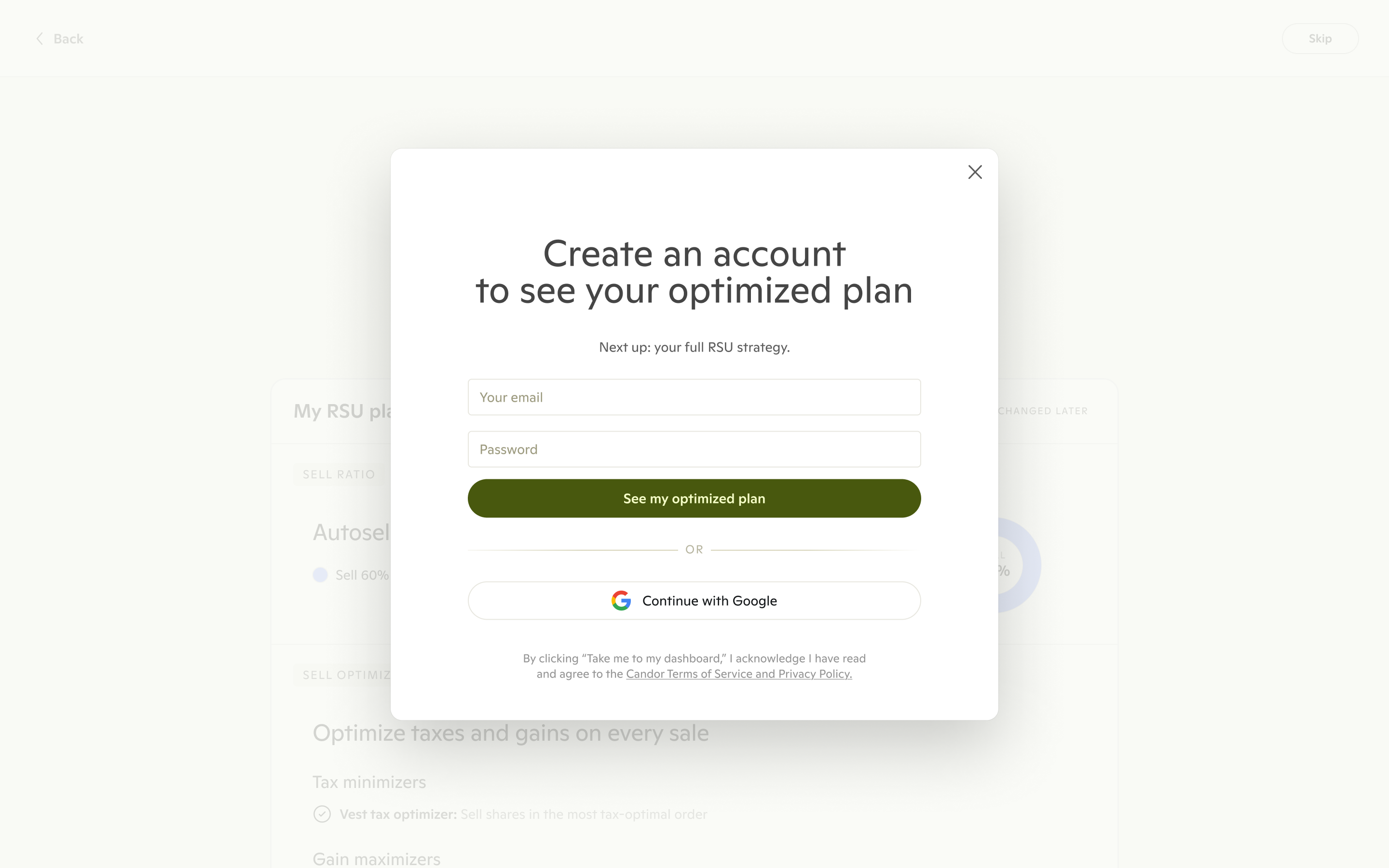
03. Sign up wall
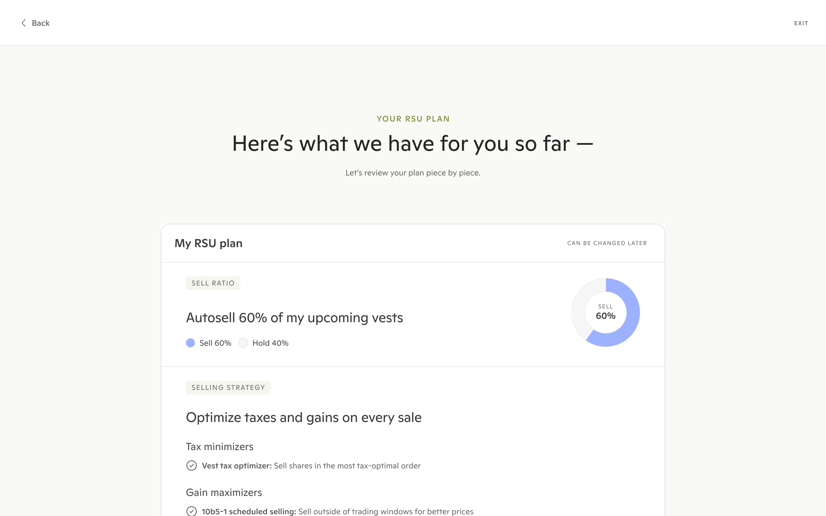
04. Recommending a plan for upcoming shares
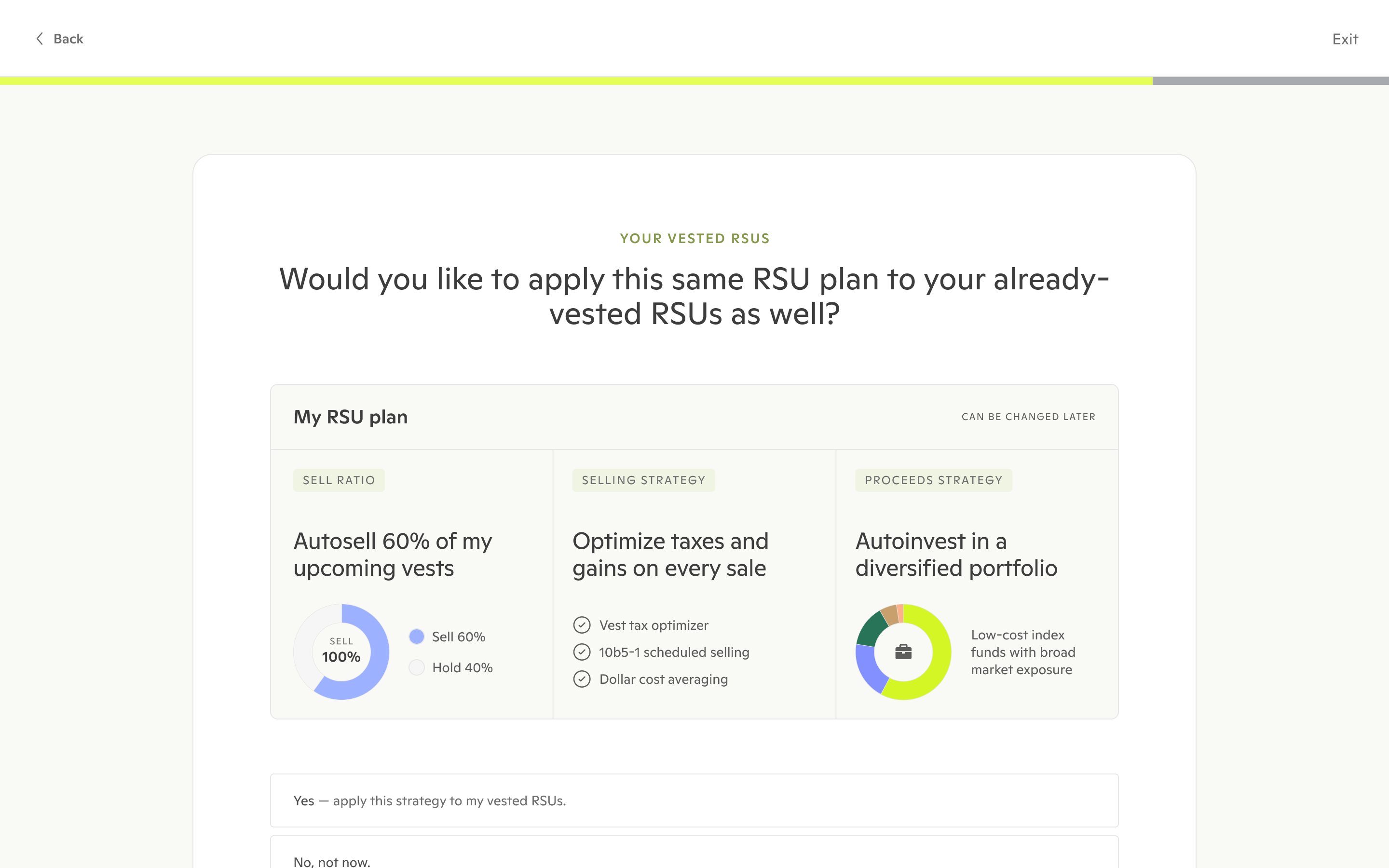
05. Extending plan to already-owned shares (optional)
06. Loading the dashboard
*Absolute numbers omitted per NDA.
*Yes, the numbers seem big, but it's normal for a startup :)
* I collaborated with a design colleague on this onboarding redesign work. All other research and design work showcased below is my own.
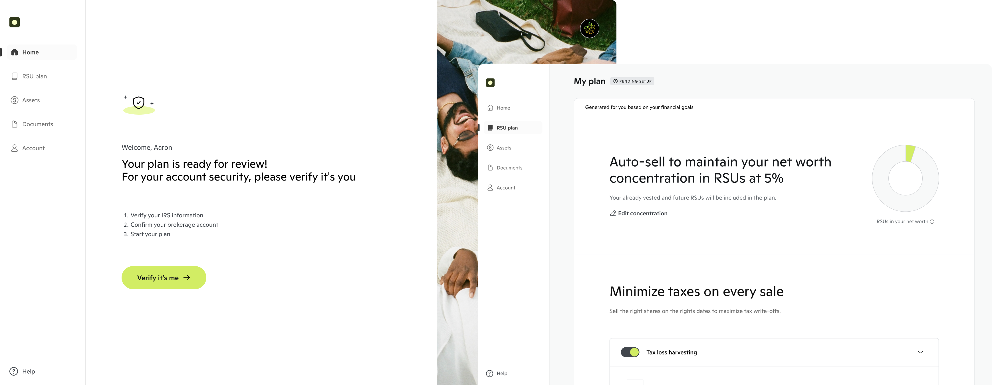
Created an account
at the quiz midpoint
Finished the quiz
after signing up
Problem: While the quiz complete rate was lifted, users dropped off during final activation steps: completing profile, connecting RSU account, and initiating trades.
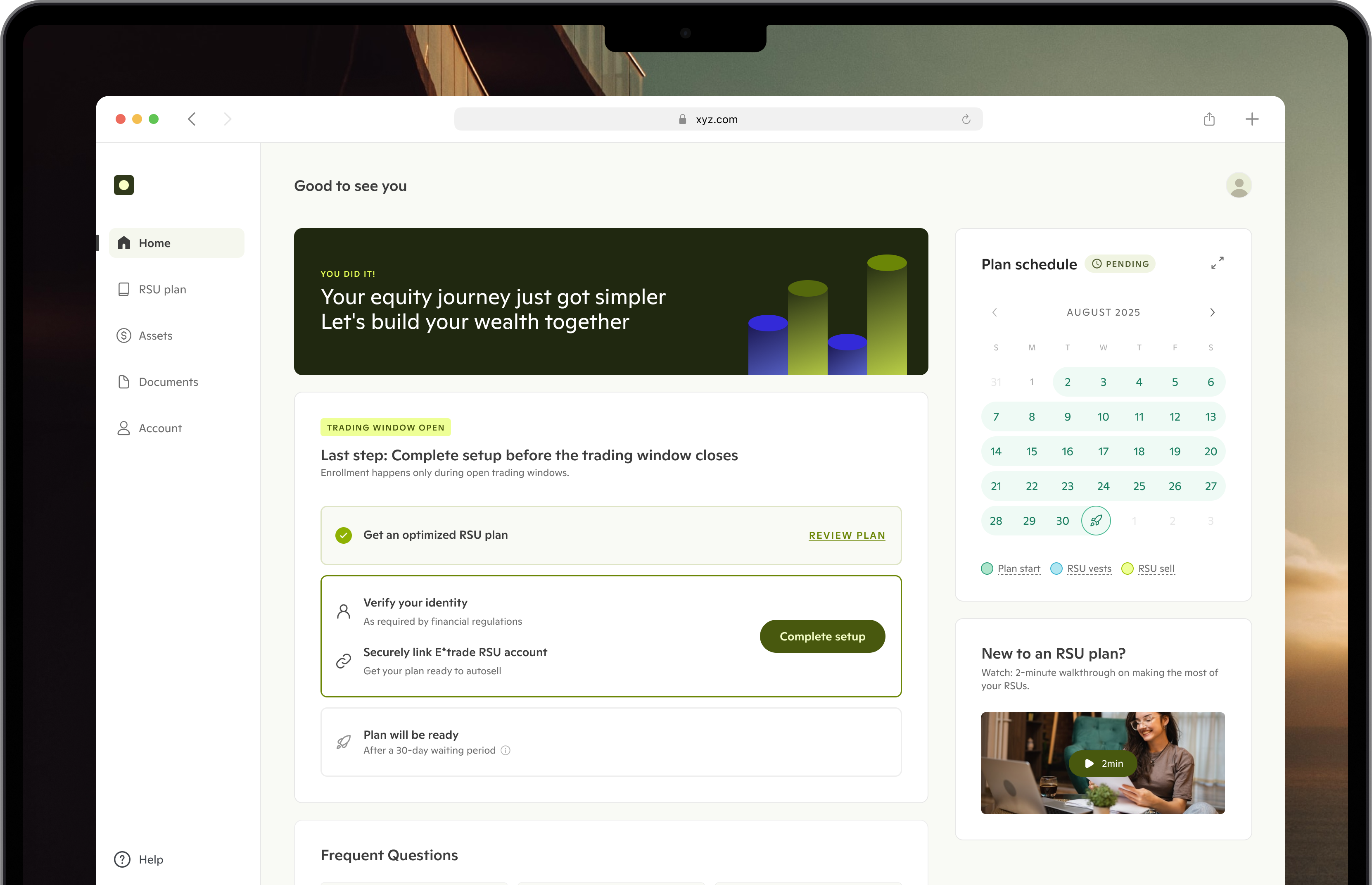
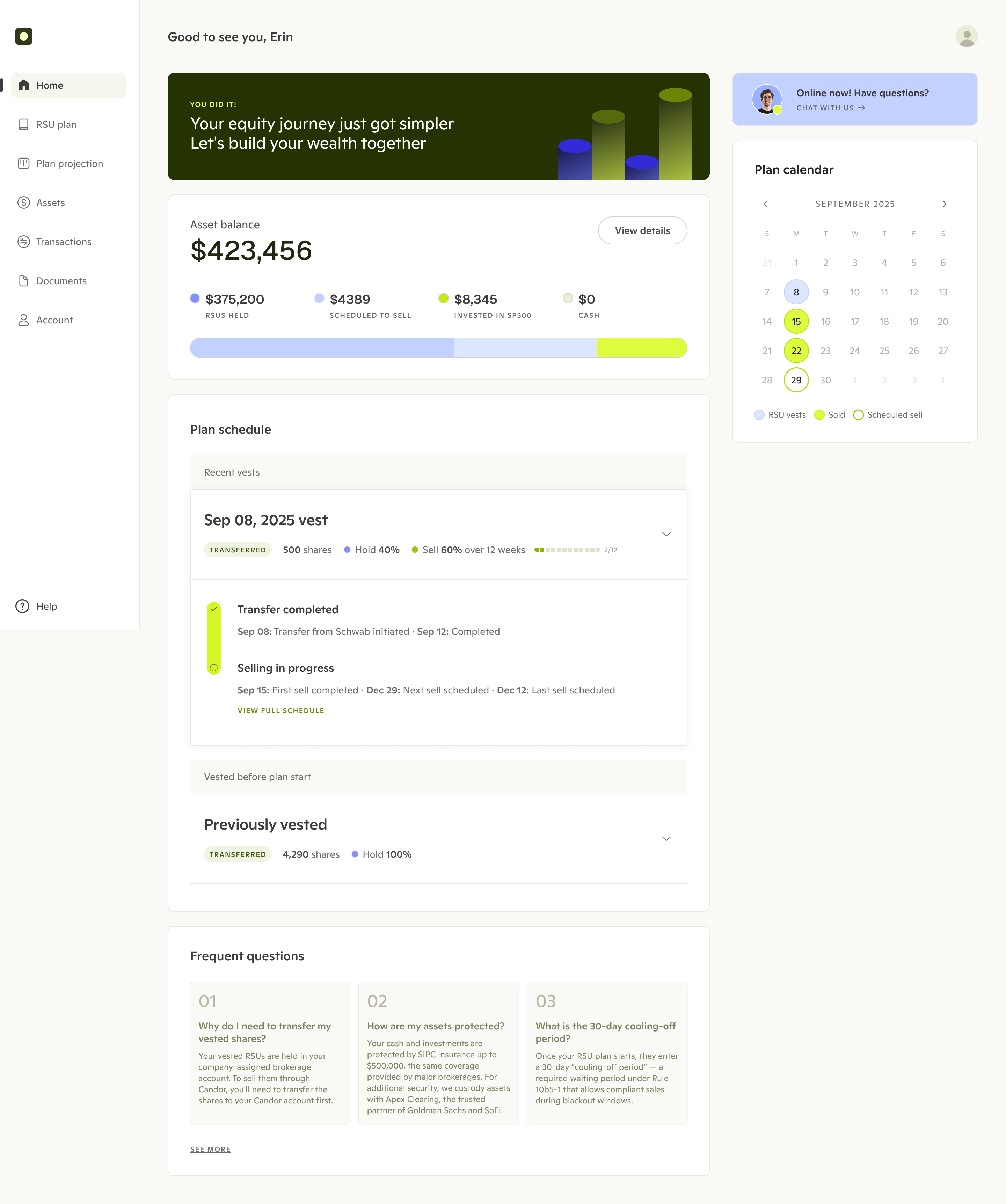
Solution: 1. Designed a new projection dashboard to help users with their financial planning and execution timelines to build confidence; 2. created an urgency-driven homepage; 3. simplified the setup process. Key screens:
01
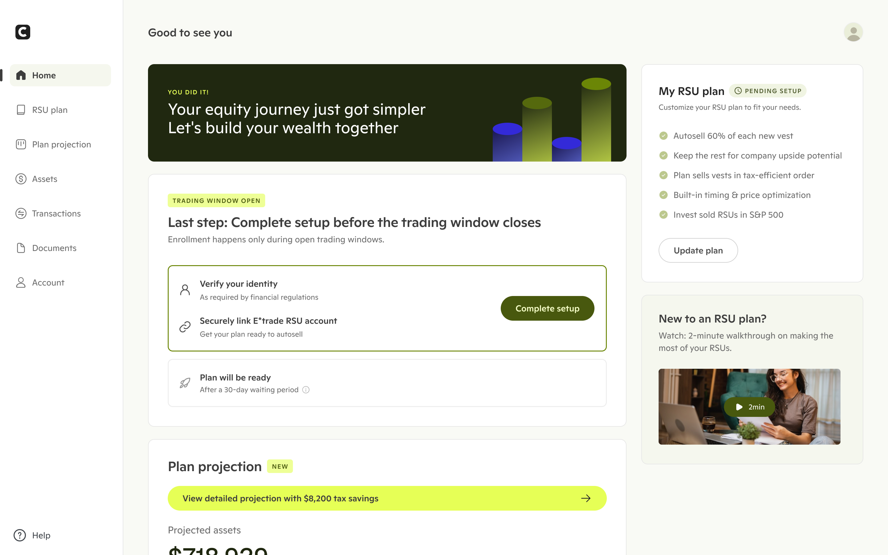
Urgency-driven home page with an entry point to the plan projection page
02
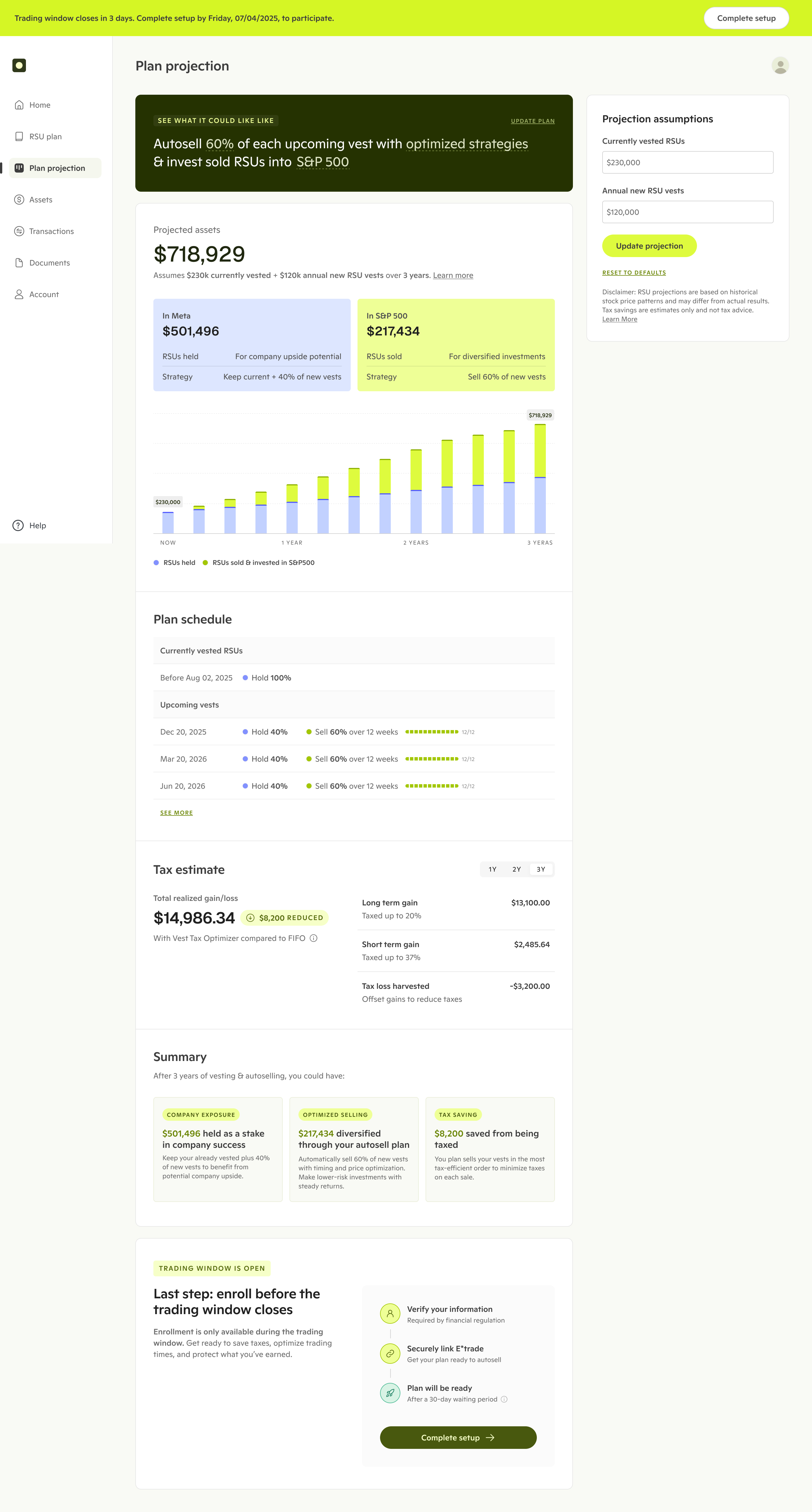
Projection dashboard focusing on financial planning and plan execution visualization
03
Redesigned plan setup page

04
Simplified account setup process
Connected accounts and activated their plans
When users started trading with us, annual fee will be deducted from their account, marking paid conversion. I extended the new design elements to post-activation for clearer plan execution tracking with the goal to reduce post activation cancellation and support efforts.
Despite strong initial interest, conversion was underperforming, limiting growth. We were seeing drop-offs at every stage—from signup through final plan adoption and payment.
Since conversion builds phase-by-phase and previous attempts had failed without documented understanding of root causes, I conducted holistic research to uncover why users were abandoning at each stage.
Analyzed analytics data on Amplitude to identify specific drop-off points in the funnel
Pinpointed high-friction moments to investigate through user interviews/testing
Tested end-to-end 1st-time user journey with 12 participants
Defined user segments and mapped their unique pain points
Initially, there were lots of different ideas on what we should build. After identifying three distinct segments, I was able to identify their conversion viability and strategically prioritize ideas.

Characteristics
- Already selling or planning to sell
- Less optimistic about company stock price future growth
- Need cash for a specific goal
Problem
Lack clarity on value and execution process to make decision now

Characteristics
- Stock performing well
- Believe in diversification and don't want to hold too much in one stock
- Want to reduce risk, but not urgently
Problem:
Decision paralysis around how much to sell and when

Characteristics
- Stock performing well
- Don't understand or believe in diversification
- No immediate reason to sell
Problem:
Unconvinced of the need to sell
I advocated for prioritizing high and mid-intent users first. Low-intent users required convincing on why to sell, needing a more complex journey. By focusing on the first two segments, we could make focused efforts, deliver quick wins, and validate our approach before tackling the more challenging low-intent segment.
Based on specific pain points discovered along the user journey, I collaborated with a product manager to generate 10+ hypotheses mapped to each funnel stage. I addressed all 12 hypotheses in phases, starting with onboarding to maximize early funnel conversion, then activation, and finally post-activation optimization.
Onboarding
1. Redesigning marketing page to deliver clearer value props
2. Move signup wall half way through onboarding quiz
3. Remove confusing financial concepts from the quiz
4. Provide personalized selling amount recommendations
5. Clearly introducing the recommended plan with an overview and skippable walkthrough
6. Lower commitment by making selling already vested shares optional
7. Surfacing reinvestment vs cash out options upfront
Activation
8. Create urgency for action
9. Projecting plan execution with concrete dollar amounts to help with financial planning
10. Visualize automation to reinforce confidence
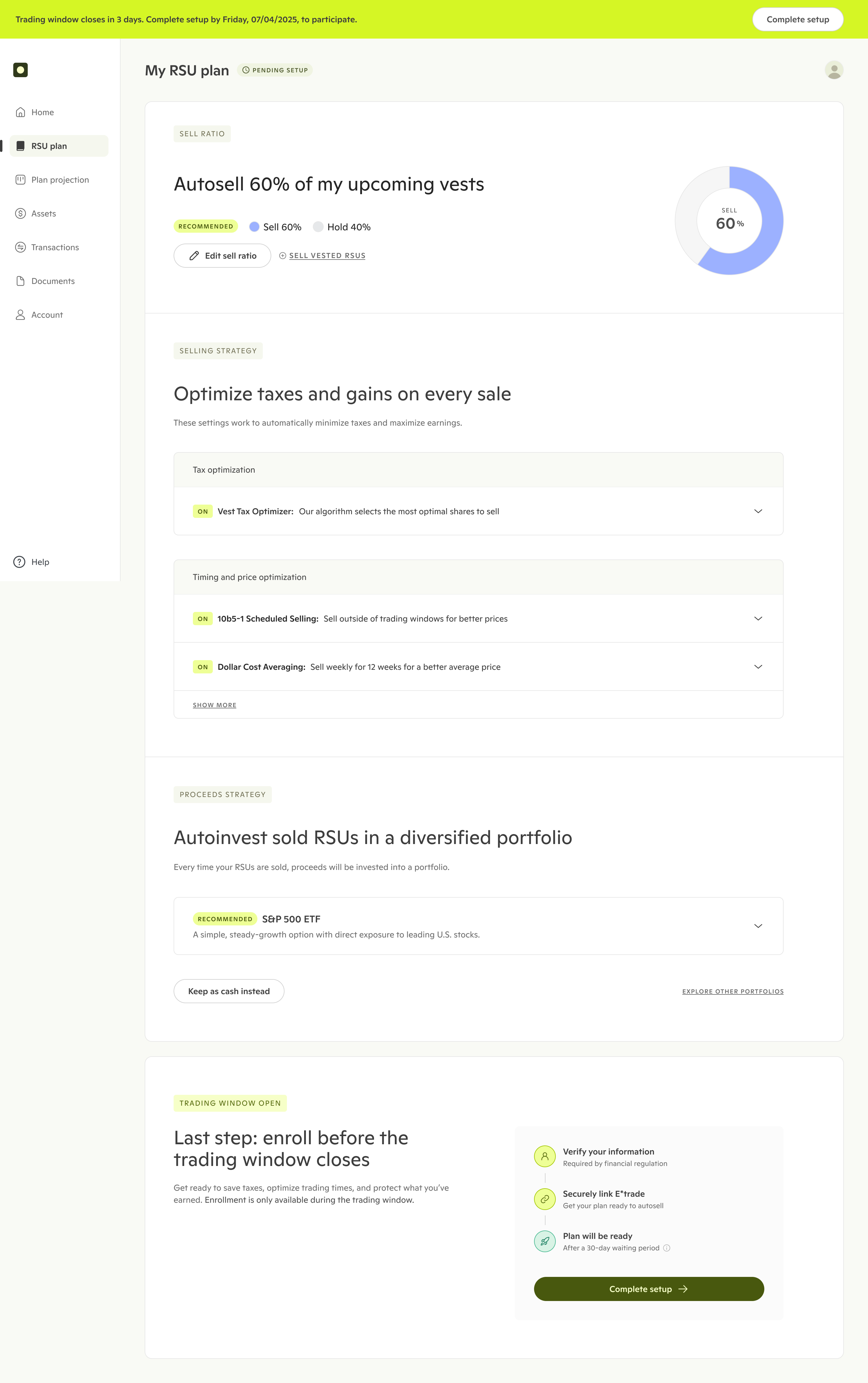
11. Simplify reinvestment portfolio selection
12. Simplify setup process
Post-activation
13. Clarify automation process with clear progress tracking
Previous experience: after users completed onboarding quiz, they would arrive at the home page and a good amount of users would visit the plan page again to check their plan settings. To activate their plan, they needed to provide sensitive personal information—SSN, address, and financial details—and connect their brokerage account. Despite the strong onboarding quiz completion rate, most users dropped off right after.
What did they need to feel confident enough to take this final, high-stakes step of completing setup?After reviewing the previous designs, I identified two primary hypotheses for the drop-offs:
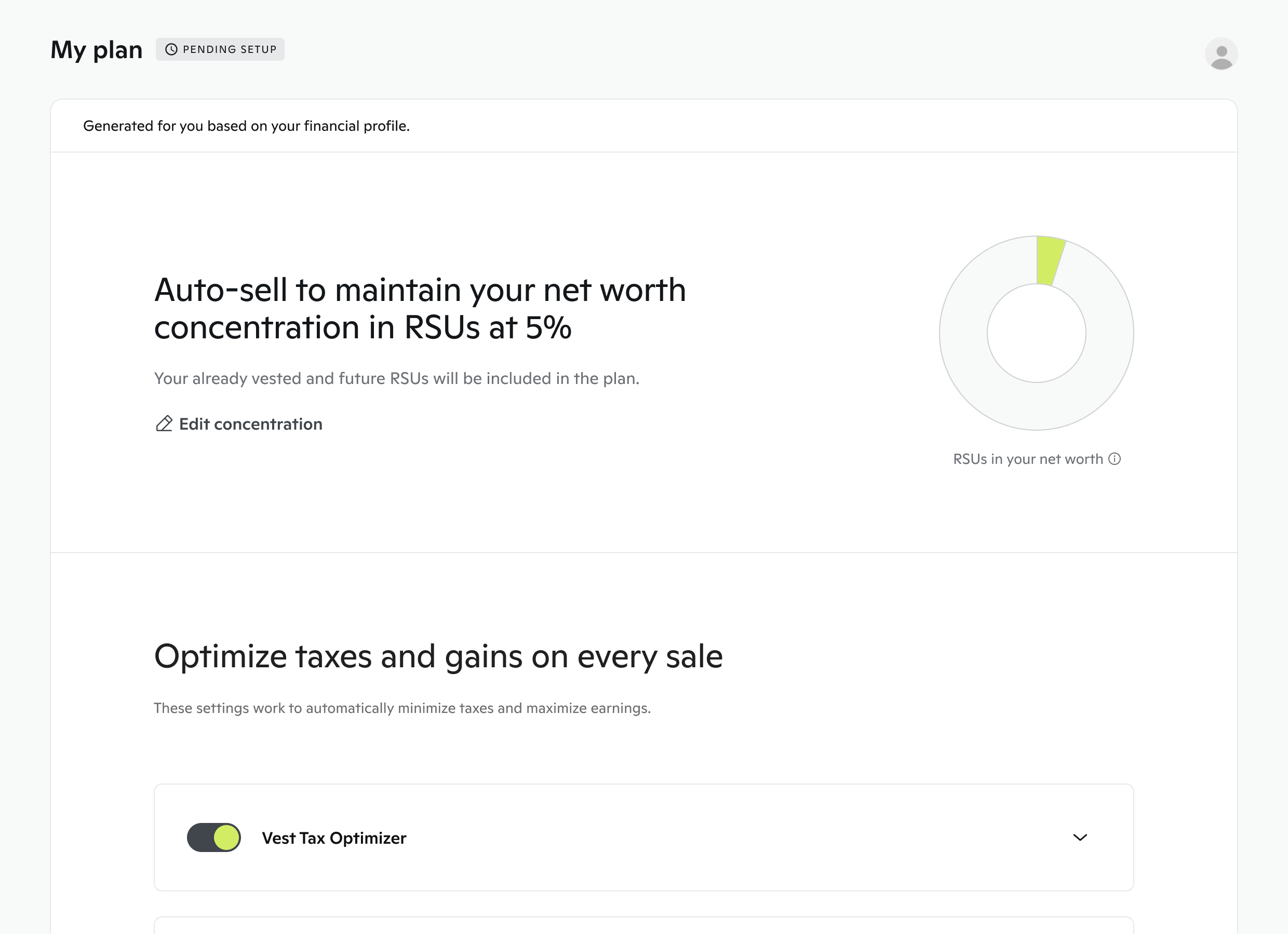
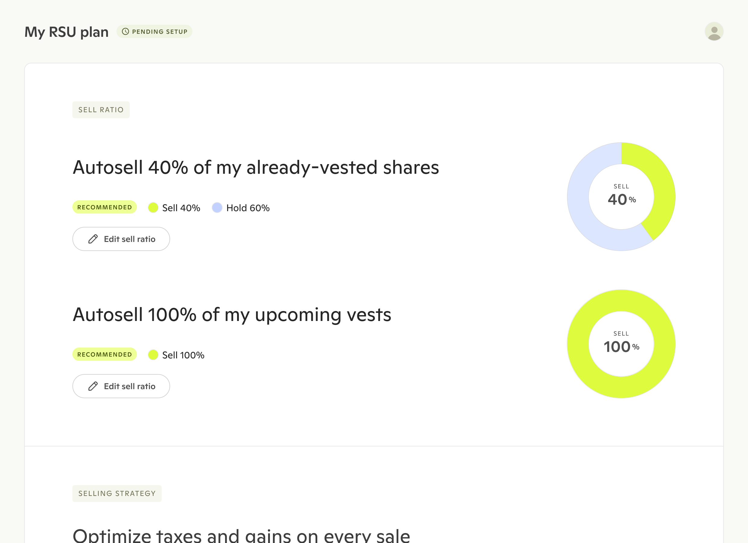
"Maintain X% of networth in RSUs" didn't tell users when or how much we'd sell, creating uncertainty about execution.
Applying the plan to already-owned shares (potentially significant value) felt risky. Starting with upcoming vests would lower commitment and build trust incrementally.
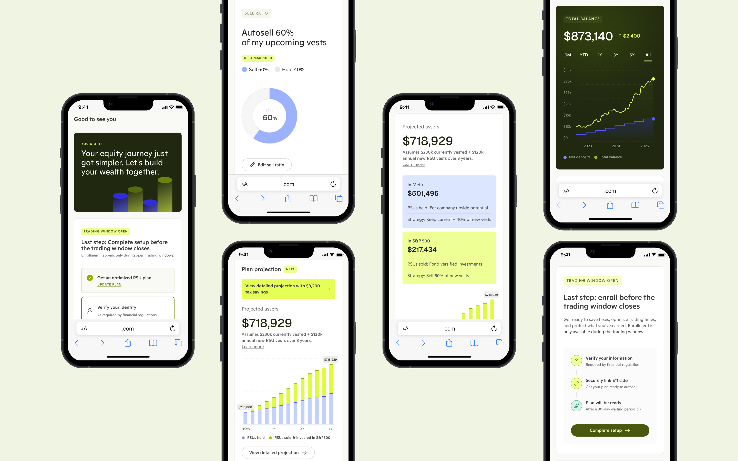
Split vested vs. upcoming sharesUsers can start with future compensation without touching shares they already own, reducing commitment pressure and matching their mental model.Concrete percentages instead of abstract targets"Sell 40%" is immediately clear, while "maintain 5% concentration" requires financial expertise.Visual representation of the splitDonut charts make the sell/hold ratio instantly graspable.
BEFORE
AFTER
Based on 5 additional user tests, I validated that splitting vested/upcoming shares reduced commitment pressure. However, users still found the plan too abstract and needed more transparency about execution.
Users couldn't trust what they couldn't see. Without transparency into when, how, and whether the product would execute trades as promised, they weren't willing to hand over their SSN and activate their account.
Will it actually work like it said would? Will it sell my upcoming vests over 12 weeks?
What happens next? Is there a schedule of when the selling will happen?
Users needed control of their finances, but the product focused solely on abstract settings without showing what their investments would actually look like. That uncertainty would stop them from moving forward.
I need to know the actual dollar amounts—how much I'm selling versus how much I'm investing. That's what matters for my financial planning.
If I understood exactly how much money I'm putting in and what's happening with it, I'd feel way more comfortable using this.
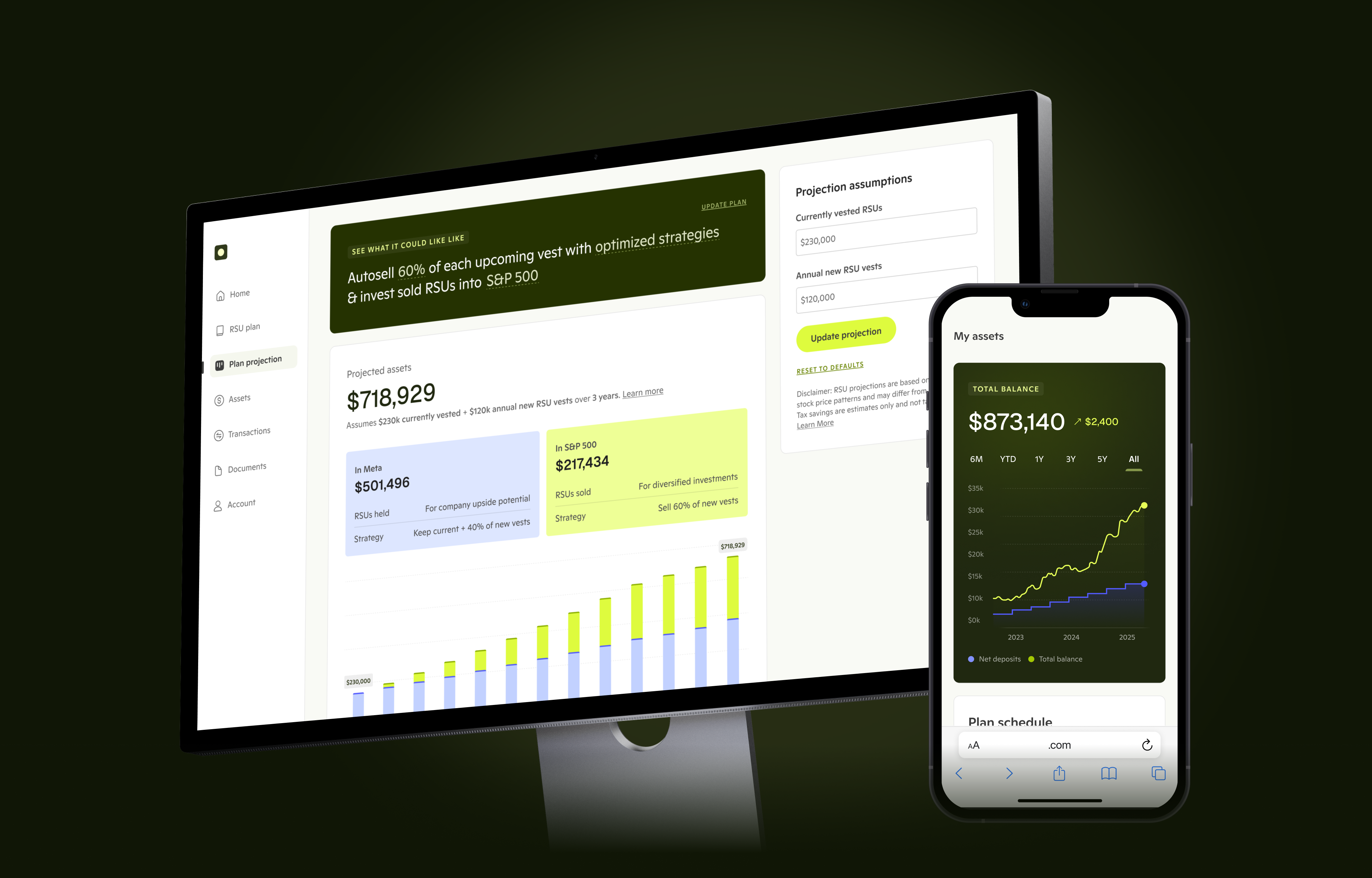
The projection dashboard solves both pain points by showing users exactly what would happen with their money before committing. Since users haven't connected their accounts yet, the dashboard displays projected portfolio estimates based on their plan settings. Final design and rationales:
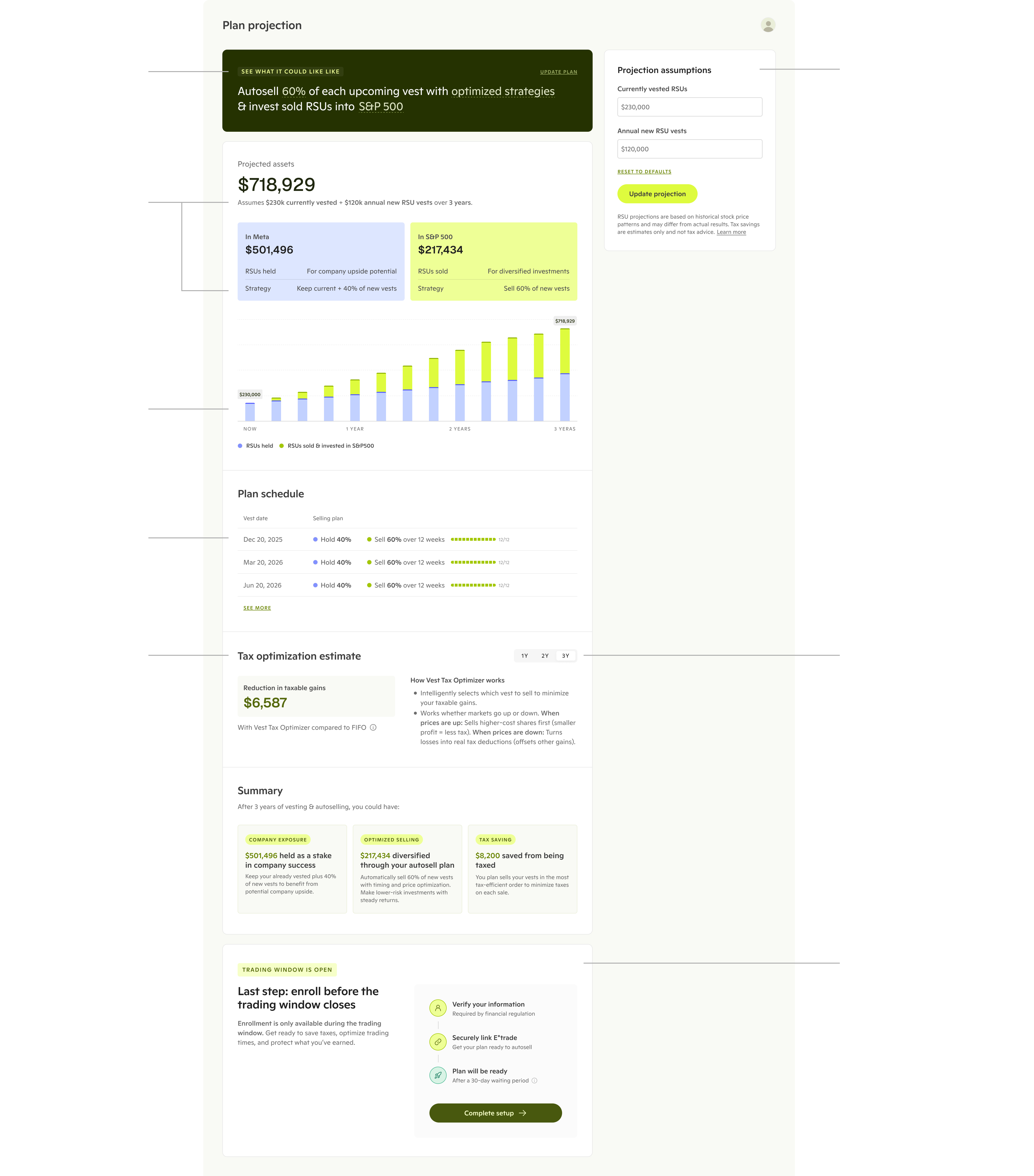
Before arriving at the final design, I tested designs with 5 participants and sought engineering and domain expert feedback.

User feedback: The numbers don't add up to the total assets, causing confusion.

Updates: Create a separate tax estimate section
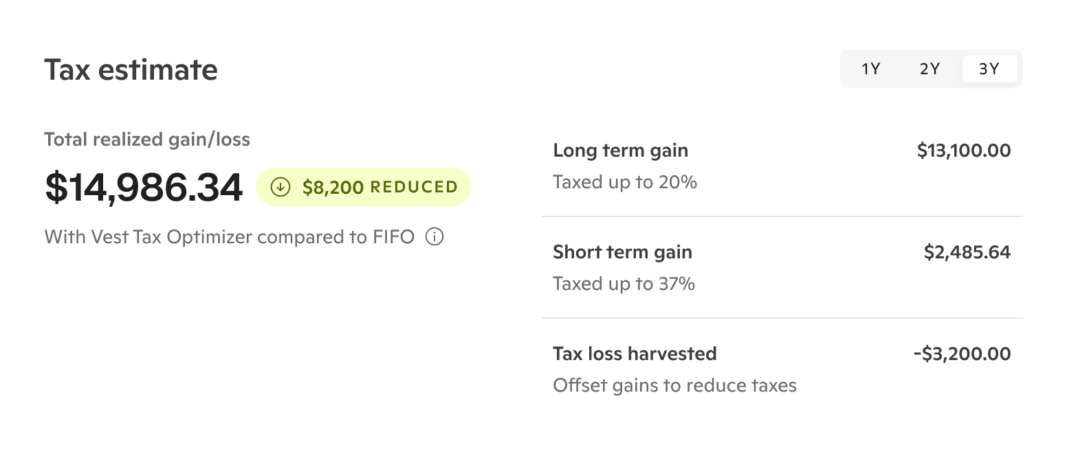
Engineering feedback: The realized gain/loss and detailed breakdown becomes confusing when projecting negative values, obscuring the actual benefit.

Updates: Simplified to show net tax savings, making the optimization benefit immediately clear regardless of whether gains or losses are projected.
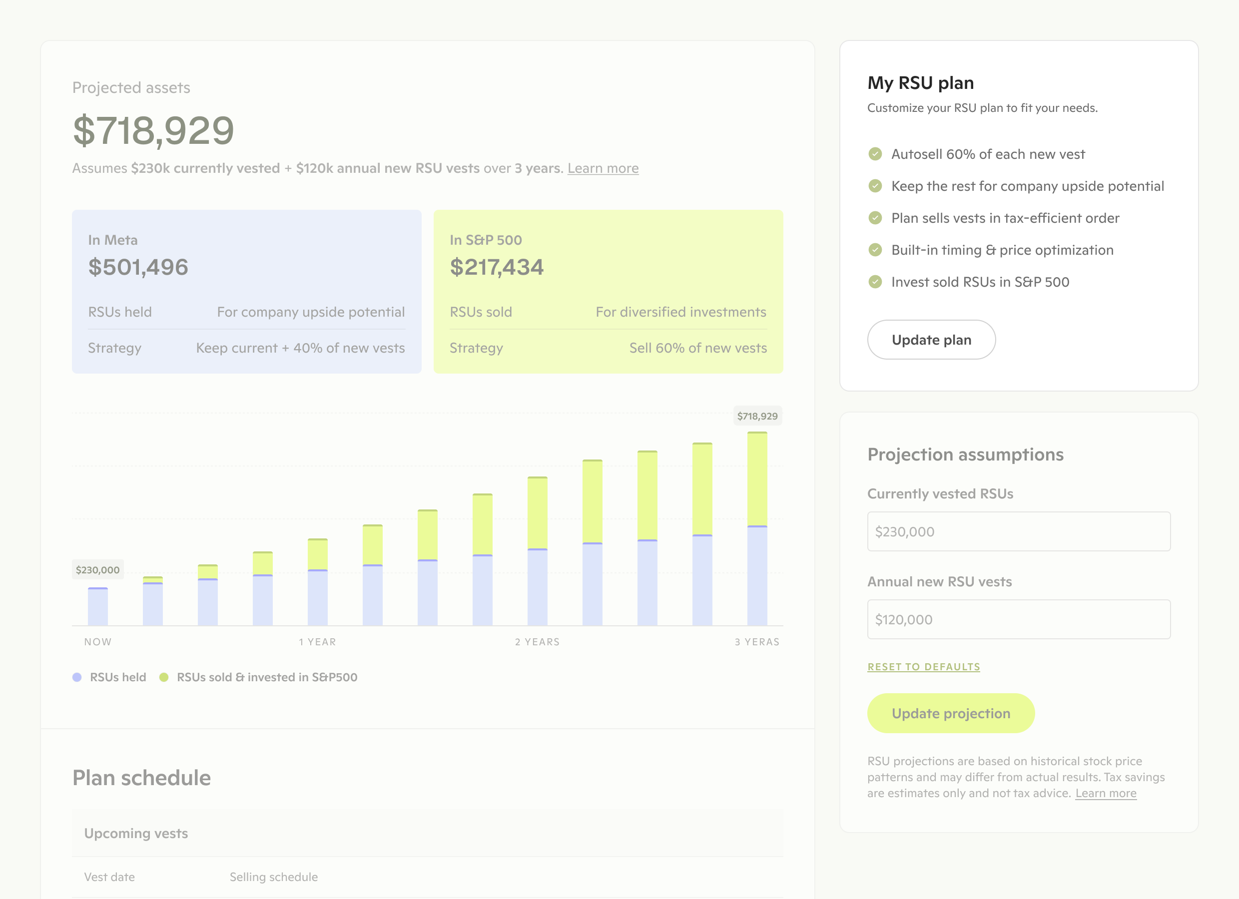
Users were confused about whether they were viewing a projection or their actual plan, reducing confidence in the information presented.
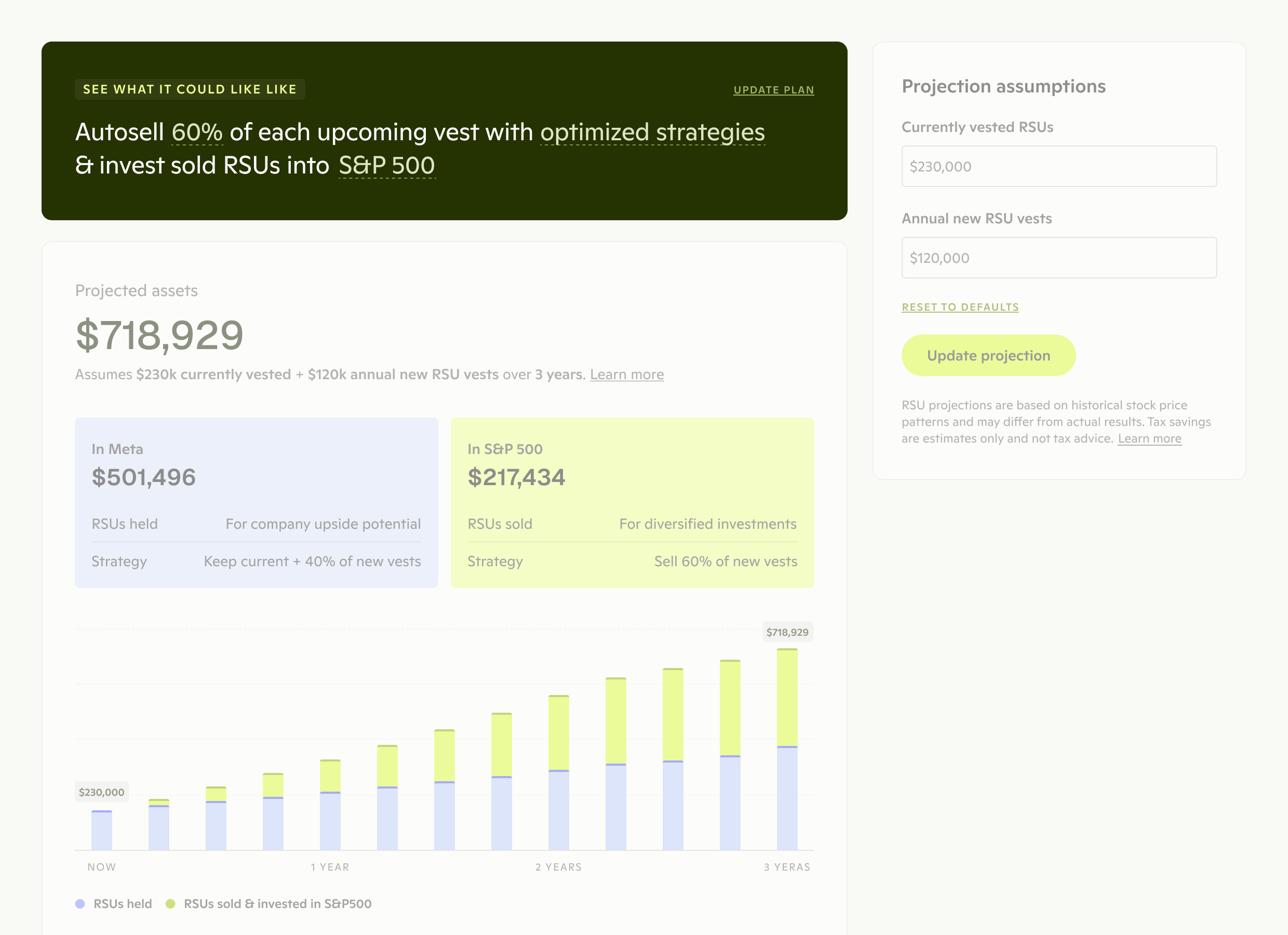
Relocated the plan summary to the top to immediately clarify that users are viewing a projection based on the automated optimization strategy.
The previous home page focused solely on pushing users to complete setup. I redesigned it to remain action-oriented while prominently surfacing the plan projection.

BEFORE
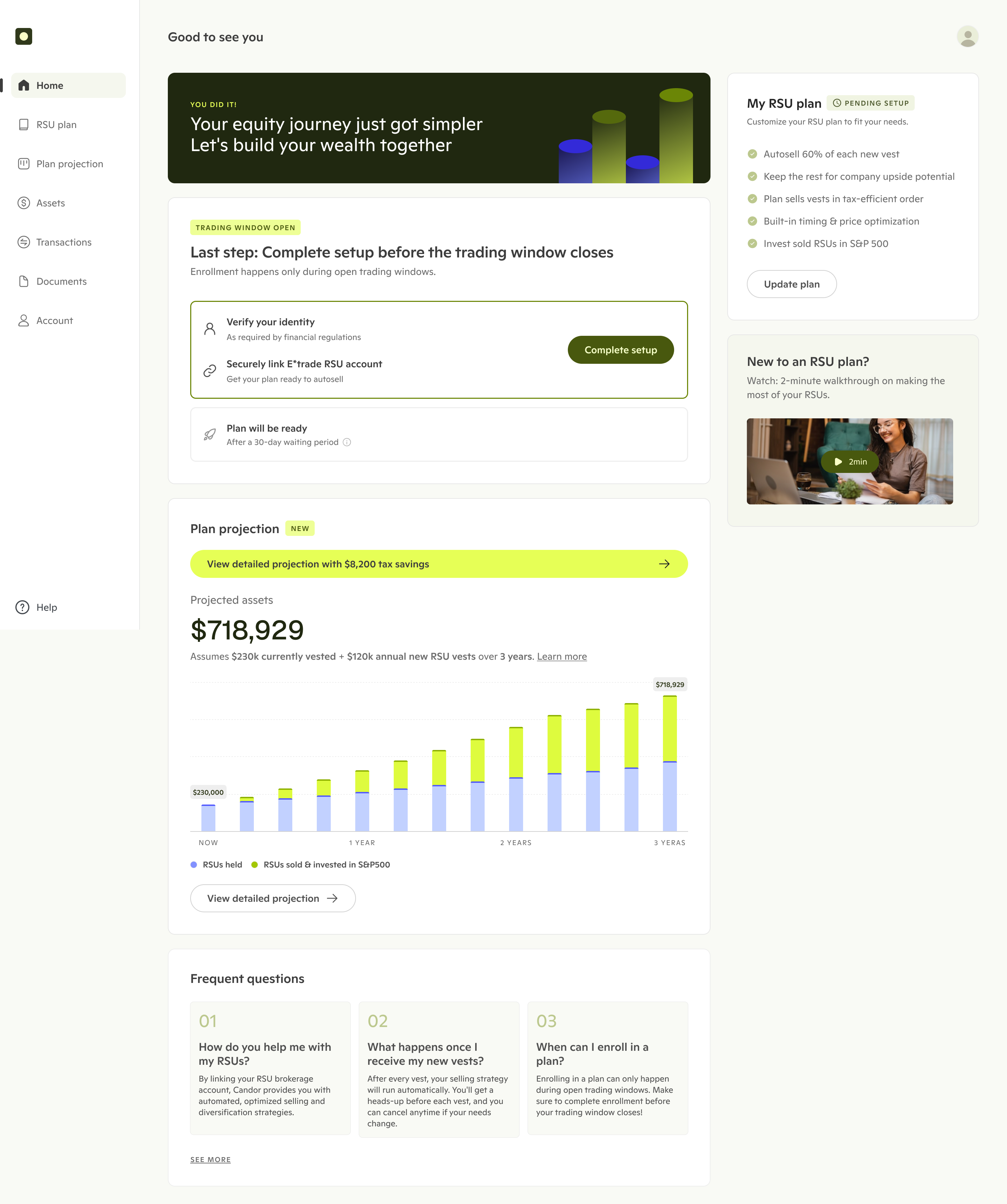
AFTER
I redesigned the plan experience to provide transparency and control—showing users what would happen (projection dashboard) and giving them concrete ways to adjust it (plan settings). These changes led to:
Connected accounts and activated plan
1st trade executed and annual fee paid
By expanding research beyond my initial scope, I identified systemic issues across the journey rather than solving activation in isolation.
Navigated the intersection of financial regulations, technical limitations, and user psychology. Translating complex financial concepts into transparent and confidence-building experiences takes deep domain understanding.
Showed users exactly what they needed to commit—projected outcomes and execution timelines—without overwhelming them with every detail upfront. Too much transparency can paralyze rather than empower.

